
The United States faces a number of economic and fiscal challenges in the short and long terms. But the single biggest is the Growth Deficit: the problem of government spending and government debt growing faster than the private sector. That deficit needs to be reversed; we are on an unsustainable path unless we start producing a Growth Surplus. And Republicans and conservatives need to put more effort into emphasizing the importance of the Growth Deficit to the public.
The Obama Administration seems to recognize that this is a political vulnerability, as it has lately been spinning the notion that the last few years have not actually grown federal spending. Below the fold, I’ve collected a number of charts that illustrate why this is nonsense. But first, a word on how we should be measuring our solvency.
I. Operating Deficits and Credit Card Balances
We’re all familiar with the budget deficit, the measurement of how much more the federal government’s annual operations spend than the government takes in. I refer to this as the “operating deficit.” The operating deficit has really only one important role: it tells us how much of the government’s spending will lead to the issuance of new debt. While large operating deficits can be a symptom, they are not the real problem. Let me illustrate with a simplified example. Let’s say you have a credit card with a fairly low teaser rate, 2 or 3%. You are running a balance on that card instead of paying your bills on time, which means you’re paying a modest interest rate and the balance is accumulating. In terms of your credit card spending, you have an operating deficit – you’ve spent more than you paid back. But in this example, the amount you’re spending on the card isn’t that big compared to your income and savings. That balance may not be a great idea: eventually, you’ll have to pay it off, that could be a pain to do if you let it pile up too much, and if it goes on too long the interest rate will go up. But you don’t have a serious problem because you have the money to pay for what you’re spending, even if you aren’t paying your bills on time.
Now picture the opposite situation: you’re spending way more every month than you earn, but you’re still paying your bills each month by raiding your savings account. You don’t have a credit card balance, and thus don’t have an operating deficit – but you do have a serious problem, because you are spending more than you’re making, you’re using up your savings instead of adding to them, and sooner or later your savings will run out and you won’t be able to keep this up. You’ll be broke.
The credit card balance in these examples is the operating budget deficit – it tells you whether or not you’re paying your bills on time. But it doesn’t tell you whether you’re spending more than you (the American taxpayer) can afford.
To know whether we are spending more than we can afford, we have to compare government spending to the nation’s income (ie, the money being made by the taxpayers), not to how much of that income is being used in a given month or year to pay the bills when they come due. Sure, a big balance is often a sign that you’re spending too much – but you can’t cure that problem, long term, by raiding your life savings to pay this month’s bill. You can only fix it by bringing your spending in line with how much money you make in the first place. In the real world, that means we have to ask, not whether the government is taxing us enough to pay its bills, but whether the government is running up bills we can’t afford to pay with the money we make. The government can’t fix the problem of spending more than we can afford by taxing us to stay current on its bills; if it does, we’re just raiding the private sector’s savings and income to pay for today’s spending, depleting the money that’s left over to pay tomorrow’s bills. Over-reliance on operating deficits to measure fiscal health ignores this dimension by assuming that a government that is eating the private sector’s seed corn to pay today’s bills on time is healthier than one that is living well within a society’s means but doing so partly by issuing debt.
II. The Growth Deficit
What I’ve explained above is the overall parameters. The proper measurement, in my view, is to compare the total spending by the federal government to total private sector income, which can – depending how you look at these things – be measured by private-sector GDP or by Gross Domestic Income. Phil Kerpen, for example, makes the case for using private-sector GDP.
Economist and investment manager Rob Arnott adds another way of looking at the question, arguing that besides private sector GDP we can look at what he calls “structural GDP” – GDP minus the operating deficit. The theory for that is that including operating deficits in GDP growth figures lets the government massage the numbers:
Let’s suppose the government wants to dazzle us with 5% growth next quarter (equivalent to 20% annualized growth!). If they borrow an additional 5% of GDP in new additional debt and spend it immediately, this magnificent GDP growth is achieved! We would all see it as phony growth, sabotaging our national balance sheet – right? Maybe not. We are already borrowing and spending 2% to 3% each quarter, equivalent to 10% to 12% of GDP, and yet few observers have decried this as artificial GDP growth because we’re not accustomed to looking at the underlying GDP before deficit spending!
From this perspective, real GDP seems unreal, at best. GDP that stems from new debt – mainly deficit spending – is phony: it is debt-financed consumption, not prosperity. Isn’t GDP, after excluding net new debt obligations, a more relevant measure? Deficit spending is supposed to trigger growth in the remainder of the economy, net of deficit-financed spending, which we can call our “Structural GDP.” If Structural GDP fails to grow as a consequence of our deficits, then deficit spending has failed in its sole and singular purpose.
I’ll return to Arnott’s charts later, but one of the things that’s frustrating in evaluating this issue is that consistently collected private GDP figures over time are not that easy to come by. The BEA has them in one dataset from 1963-97 and a different method of collecting the data from 1997-2010, although the numbers appear to be reported in “current dollars.” (General note: I’m happy to hear from people who have better ways to skin this particular cat in terms of measurements). The fact that we’re not reporting a regular, widely-used and easily available private sector growth measurement is itself a symptom of the failure to popularize thinking in these terms.
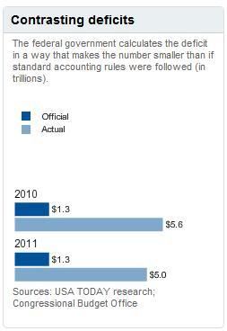
Another methodological problem is that federal operating deficits tend not to get reported honestly. USA Today had a big cover story this morning on this, noting the various items (like new liabilities for entitlements) that get exempted from officially reported deficits. USA Today’s chart illustrates the impact:
A proper picture of our fiscal health would look at three variables – private sector GDP compared to spending and debt. (It would also look at state and local government spending and debt. In fact, a good deal of the explosive growth of federal spending the past several decades, in particular in the Medicaid, education and transportation areas, involves the state governments effectively borrowing money on the federal government’s low credit rating to cover their own operating deficits). That’s the balance that really matters: keeping our public spending in line with the source of income that ultimately pays for it. But it would then also track the relationship of those variables over time to see if we are headed in a positive direction (the private sector growing faster than our public obligations) or a negative one, as we are now.
That’s the problem of the Growth Deficit. We’re already spending too much of what we earn, and that in and of itself puts a crimp in the base from which we grow the private sector. But the bigger problem is that the relationship between public spending and private-sector growth has been getting worse, and is projected to get a lot worse. We have to look, over the multi-year view, at whether government spending – including things like entitlement spending and interest on debt that grow on auto-pilot – is growing faster than the private sector economy.
The picture isn’t pretty. Here is Arnott’s chart, in small format and clickable blow-out format, showing the trend since 1944 (in inflation-adjusted per capita terms) in – among other things – structural and private sector GDP (the yellowish and greenish lines, respectively), and federal outlays (the brown dotted line). Even adjusting for the fact that Arnott uses a different visual scale to measure federal receipts and outlays than to measure GDP figures, the trend of convergence between the federal outlays line and the private sector GDP line is alarming:
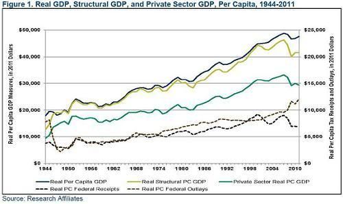
The larger version:
(Click to view full size)

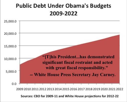
The debt trend is not encouraging either. I don’t have comparable numbers to do a proper chart of the ratio of debt to private sector GDP, and I continue to apply Crank’s First Law of Government Financial Forecasts (i.e., they are always, always wrong), but basically every measure available shows a sharp increase over the past few years, and as Phil Klein illustrates, even the White House’s own numbers show only a slight projected decrease in the rate of debt growth from 2012:
III. Spending Fairy Tales
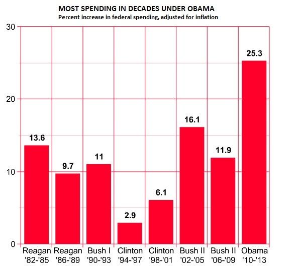
Enter the Obama White House and its allies, which are touting an ‘analysis’ by Rex Nutting of Marketwatch supposedly showing that spending has actually grown slower under Obama than under past presidents. James Pethokoukis explains here and here some of the reasons why this is nonsense (make sure to read both), and presents these two graphs to illustrate the real story. First, the properly illustrated rates of spending growth:
Second, the properly illustrated share of GDP – and again, this is comparing to GDP as a whole (including both tax-financed and debt-financed government spending, rather than just compared to the private sector).
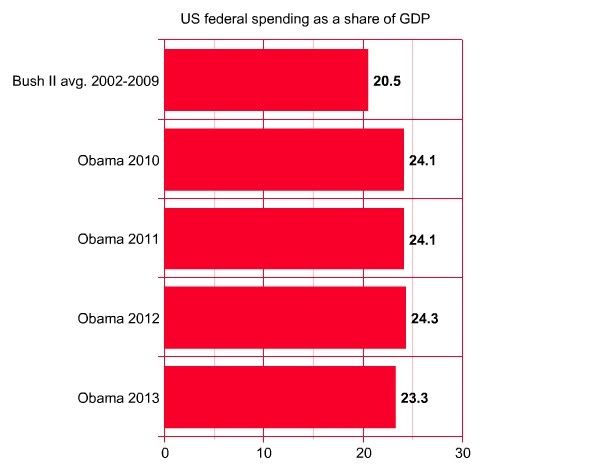
(UPDATE: Brian Darling has more on exactly why the Democrats were responsible for the 2009 budget)
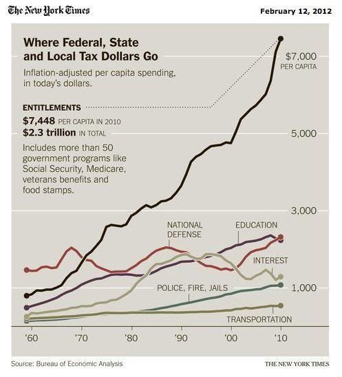
And note, these are for years before the new Obamacare spending entitlement and Medicaid expansion go into full effect, plus before the waves of retiring Baby Boomers start exploding the rates of spending by Social Security and Medicare. As this NY Times graphic illustrates, entitlements have been driving the real per capita growth of government for years:
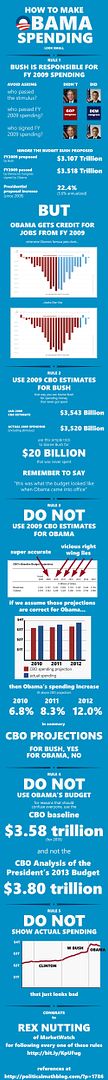
But there’s more! This enormous and excellent graphic by Political Math (again, I’m indebted to the work that went into these graphics, make sure to click the links and follow for a full explanation) shows exactly how many other bits of hacktastic dishonesty had to go into that Rex Nutting analysis:
So much of our public debate over spending and debt involves numbers with, as PJ O’Rourke once put it, vapor trails of zeroes after them, and it is dreary work indeed trying to make sense of them all. But our analytical framework should remain constant: the voters need to understand exactly how large a share of private sector income is being spent by government or borrowed against by government, and whether we are growing the private sector faster or slower than the public sector. Until we start framing the issue in those terms, we are not even asking the right questions.


Join the conversation as a VIP Member